Leafruit is designed for young, active adults who thrive in nature's purity and love outdoor adventures. Our refreshing tea and fruit juice, perfectly blended in a convenient box, bring out the vibrant energy of your true youthfulness. We believe in nourishing both the body and the planet, carefully sourcing our ingredients to ensure they are fresh, sustainable, and full of Liveliness.
Initial sketches featured a simple depiction of a fruit, leaf, and stem. After several iterations, I incorporated the active human figure within the design, visualizing the brand’s youthfulness and its relationship to nature.
It was crucial to select a typeface that aligned with the key design elements of the logo, such as its geometric balance and natural, curved lines. Filson was an ideal choice, with its clean sans-serif letterforms that seamlessly incorporate these organic curves.
Notice how the descenders of the "J" and "Q," as well as the legs of the "K" and "R," feature similarly curved lines found in the logo mark.
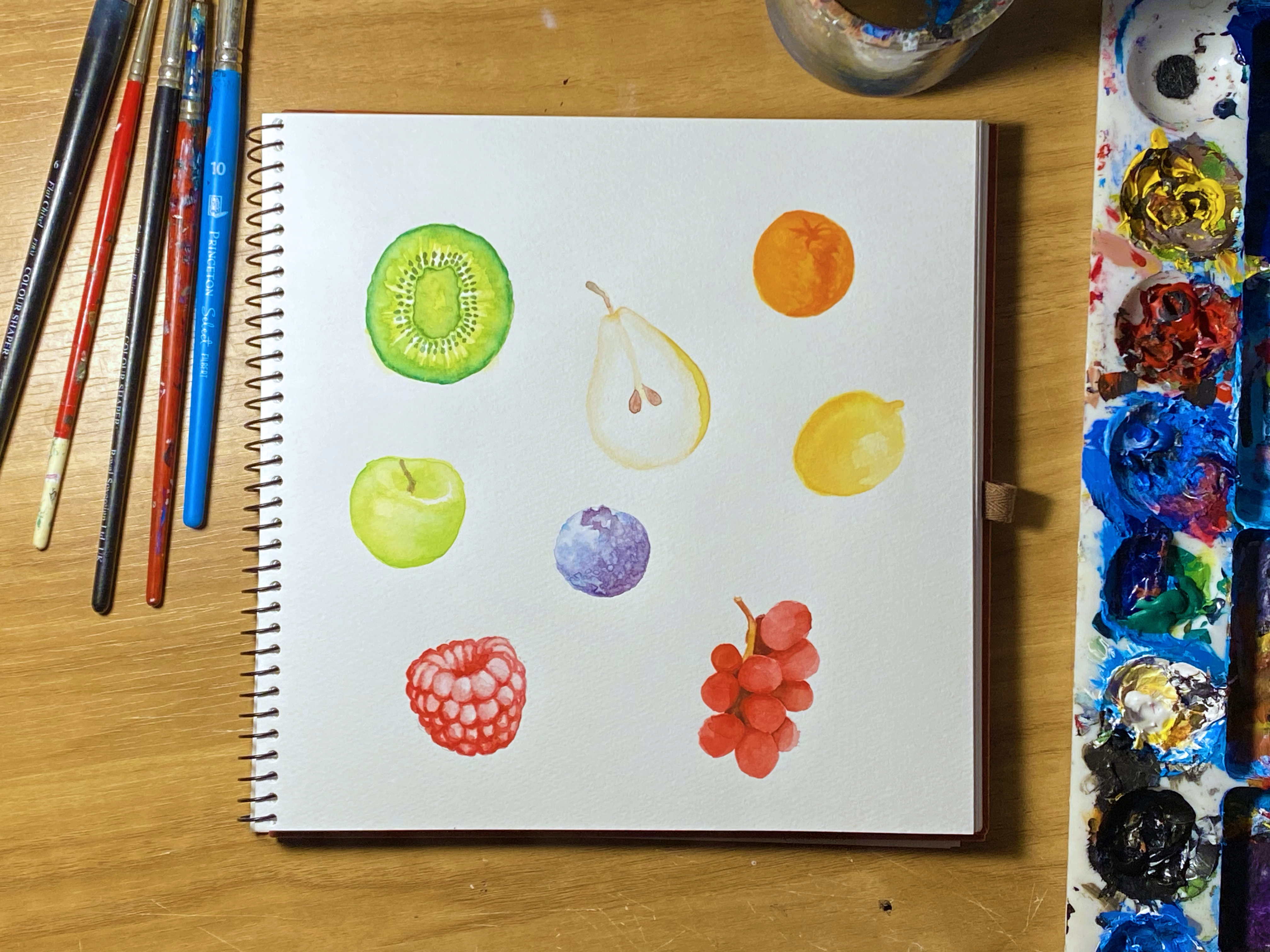
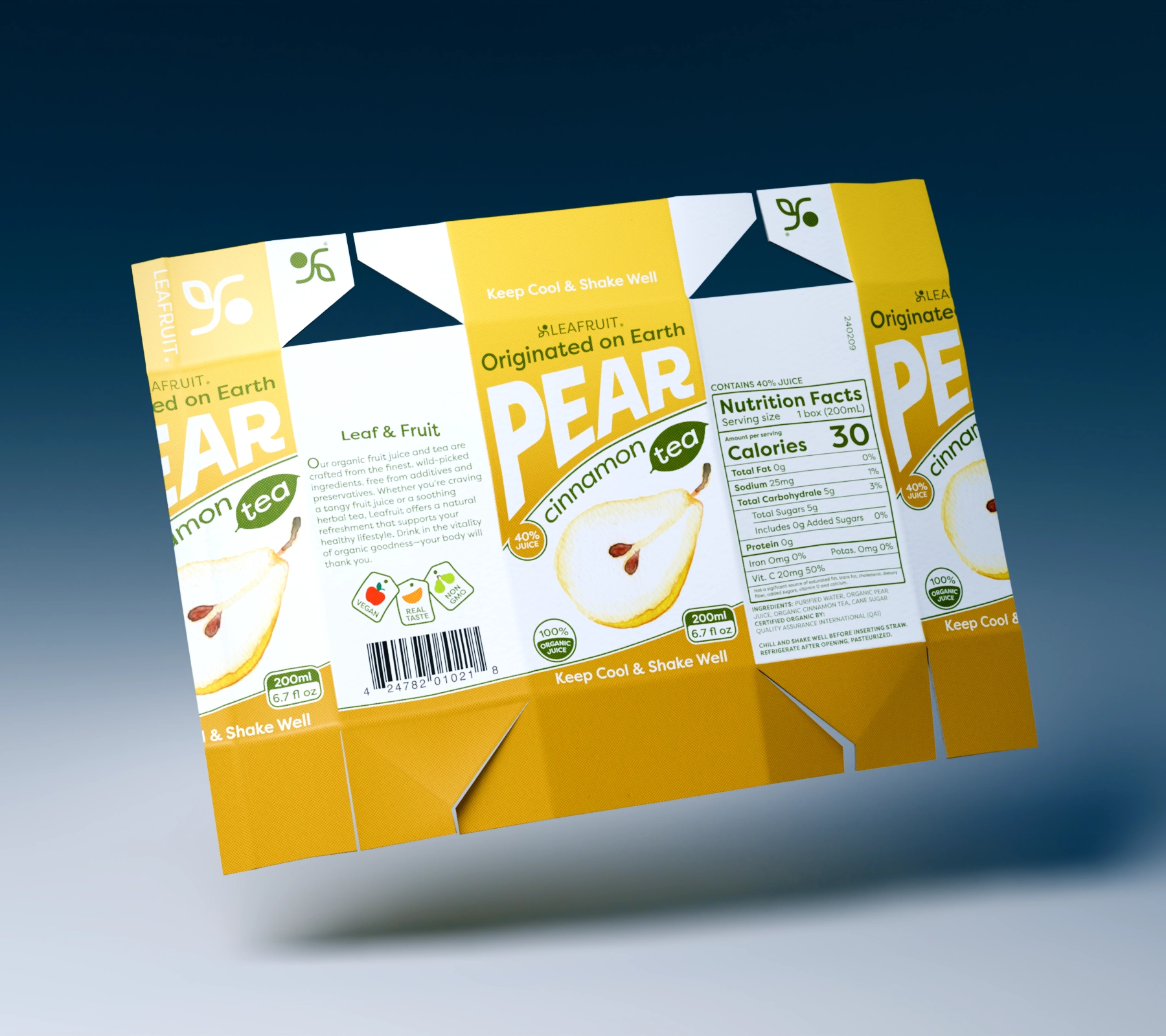
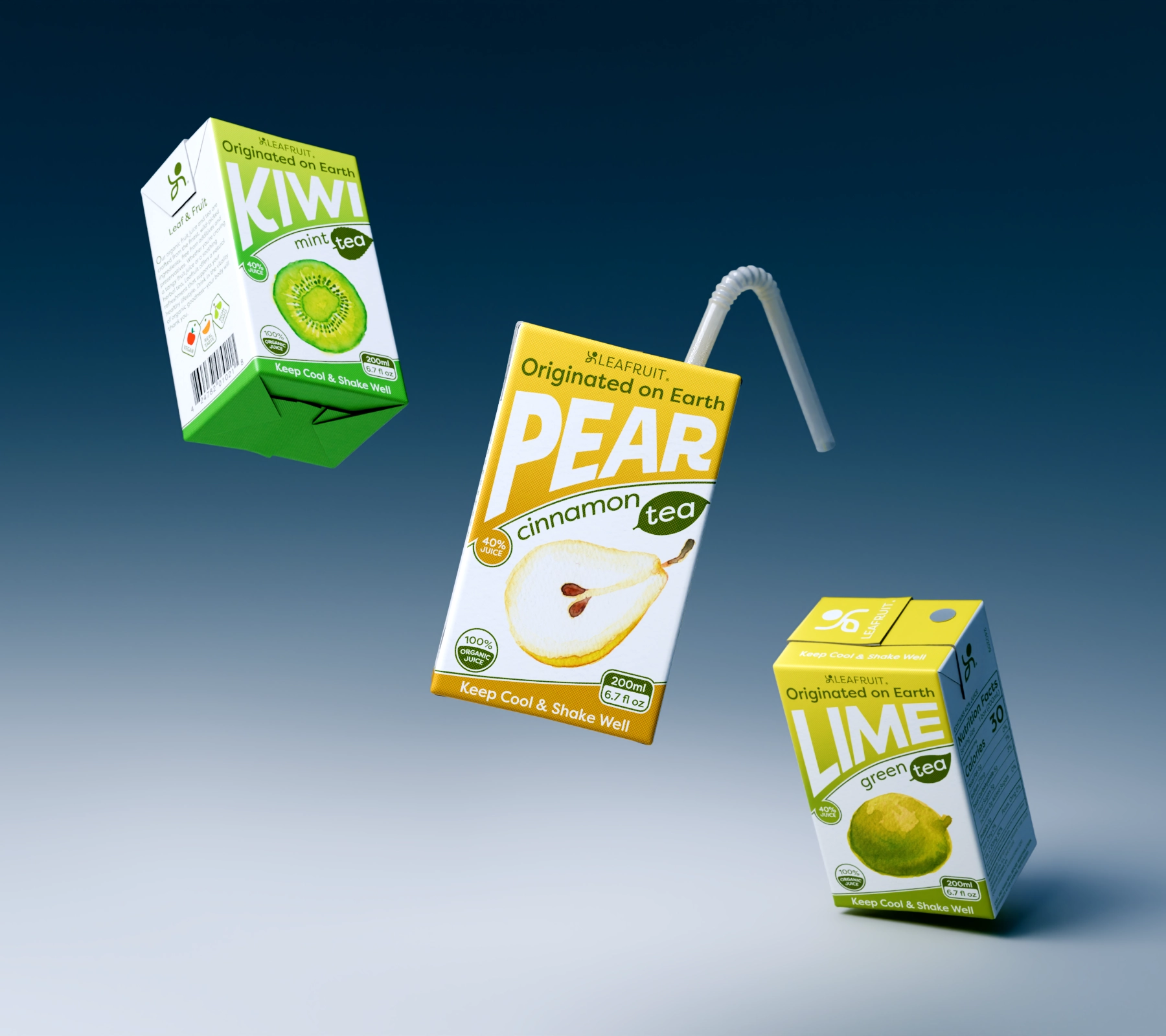
My concept centered on fruit illustrations using watercolor for its soft, dreamy visuals. Colors were carefully selected to distinguish each fruit and tea, blending seamlessly with 'Origin' and 'Earth' for a vibrant yet clean design.